Blink Mobile App
Product & Platform
iOS & Android
Timeline
2021 – 2024
Impact
Serves tens of millions of customers worldwide
As the second UX designer joined Amazon Blink, I led the creation of the design system and established core UX/UI patterns and accessibility standards that powered the next generation of products. I designed the UX/UI for six new camera products and three accessories, delivering cohesive, end-to-end experiences across iOS and Android. When I joined in 2021, app ratings were around 2.7; when I left in 2024, they had risen to around 4.6.
*This project highlights key aspects of my work at Amazon Blink. A full case study is available upon request.
Solve the Root of the Problem
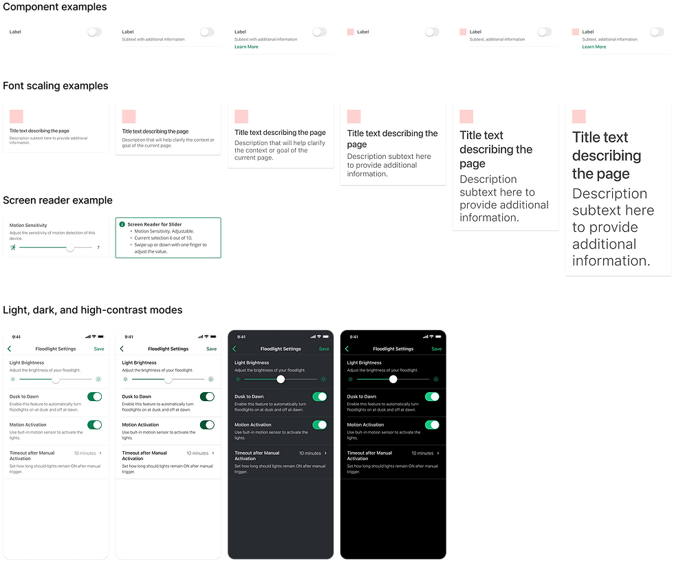
The Blink app was initially designed by product managers and engineers. While functional, it lacked consistent UI patterns, experience standards, and accessibility considerations. I identified current and future risks, evaluated solution options with short- and long-term tradeoffs, and convinced stakeholders of the value of a new design system.

With limited resources, I leveraged Ring’s design system (Blink is part of Ring’s organization) —rebranding, modifying, and adding components—while defining Blink-specific UX patterns. Within five months, the system launched and was adopted by UX, engineering, and QA teams. It enabled a major app refresh, resulting in 3× faster design and development, 70% fewer development bugs, and 96% fewer design-related issues.


Speak the User’s Language
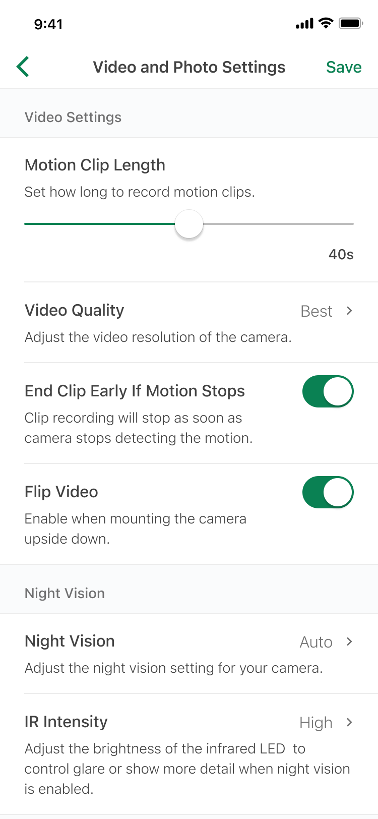
Blink devices include a camera, speaker, microphone, and multiple sensors, all configurable through the Blink app. The original UI, however, presented over 20 settings in a single long list, making it difficult for users to find what they needed. Technical terms, like “IR intensity,” added unnecessary complexity and confusion—even I struggled to understand them.


To address these issues, I reorganized settings by context to make navigation intuitive and easier to locate. I provided clear explanations for each configuration, designed simple and accessible controls, and ensured the experience was user-friendly for all. The redesign was highly successful, earning positive internal feedback and a 4.7/5 satisfaction rating in user testing, with comments like: “So much less cluttered. Love it!” and “Looks much nicer!”
Module Design for Scalability and Efficiency
Previously, each new Blink device required designing a separate onboarding flow. Although many steps were similar, inconsistencies in installation and onboarding led to a fragmented user experience and high development costs. Inspired by modular systems like Lego or IKEA furniture, I proposed breaking the onboarding process into reusable modules.

I developed this concept by collecting all existing onboarding flows, identifying common patterns, and pinpointing opportunities for improvement. I organized workshops with hardware engineers, software engineers, and product managers to validate and refine the solution. By standardizing reusable components, we improved consistency, reduced design duplication, and created a scalable framework for future devices. Users responded positively, with comments like: “The setup was a breeze.”


Example of doorbell mounting process

Small Team, Significant Success
Blink operated like a startup, with a UX team of only two designers—no dedicated researchers, writers, or visual designers. Despite minimal resources, my teammate and I delivered significant results. Both the business and customer base grew significantly. Not only did we design a world-class app, but we also received countless positive reviews and heard life-saving stories from our customers.


I’m proud of what we accomplished. Through this experience, I learned how to make high-impact decisions with limited data, navigate trade-offs, and strategically influence the product roadmap with a long-term vision.


