My First iOS App
AI is evolving fast, and new tools come out every day. As a product designer, I wanted to explore, learn, and see if I could build my own product. Working with Claude, I vibe designed, coded and launched my first native iOS app, Unit & Measure Converter. The whole process took 62 hours, from idea and product requirements to building, testing and App Store launch.
Scan the QR code to try the app, or view it on the App Store.
My Role
-

Product manager
Clarified the problems, researched similar apps, wrote the PRD, and defined the scope and priorities for the initial launch (P0) and future features.
-

Project manager
Planned the project in phases, from research and product requirements to design, build and test, and launch. Ran it step by step and documented every decision and time cost.
-

UX/UI designer
Defined the design system and owned the UX and UI of every feature, accessibility, branding and the App Store listing.
-

Engineer
Built the app’s logic and interface through Claude Code in 184 commits. Reviewed, tested and launched the app.
From Ideas to Product Requirements
I grew up with the metric system. I know how 26°C feels, but I’m not sure about 78°F. The popular converter apps I used weren’t quite right for me, and I had feature and design ideas for a better app that fit my own needs.
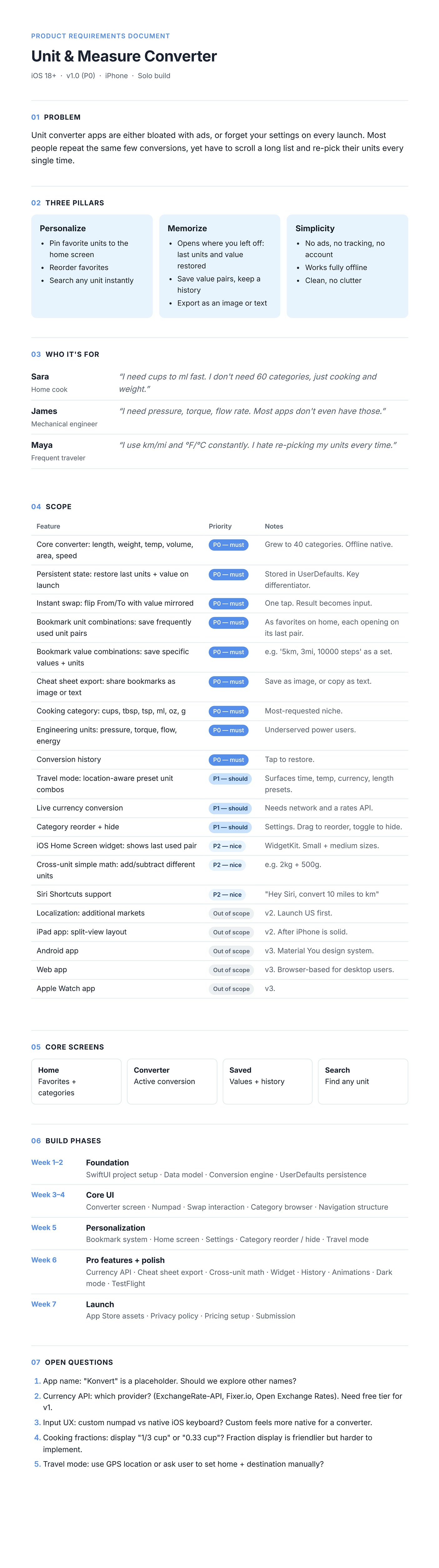
Starting with those ideas, I did competitive research, brainstormed features, and expanded them into a detailed product requirements doc. To stand out from other apps and give the product a clear identity, the app focuses on three key aspects.
Vibe Design
Start from words, then wireframes
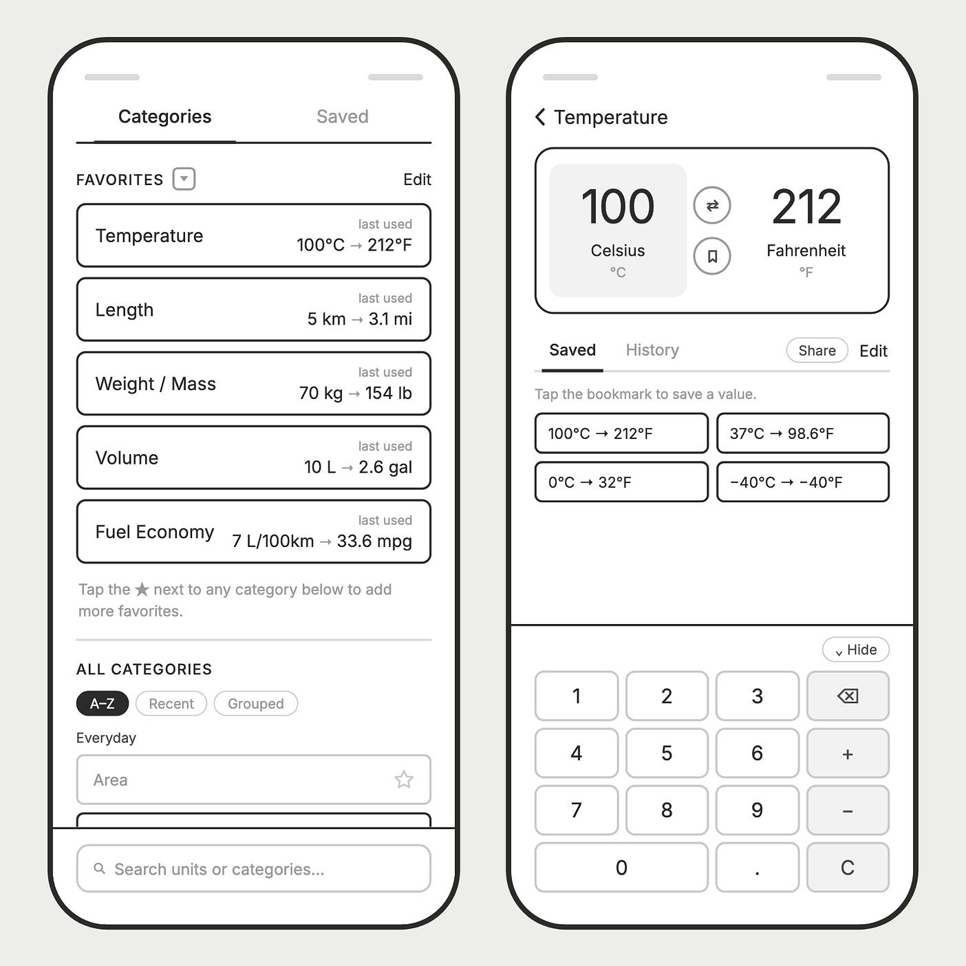
I began by describing the wireframe structure in words: the key screens and flows. Claude turned my descriptions into low-fidelity wireframes, so I could check the structure and states, like empty favorites and edit mode, before any visual design.
Sketch when words fall short
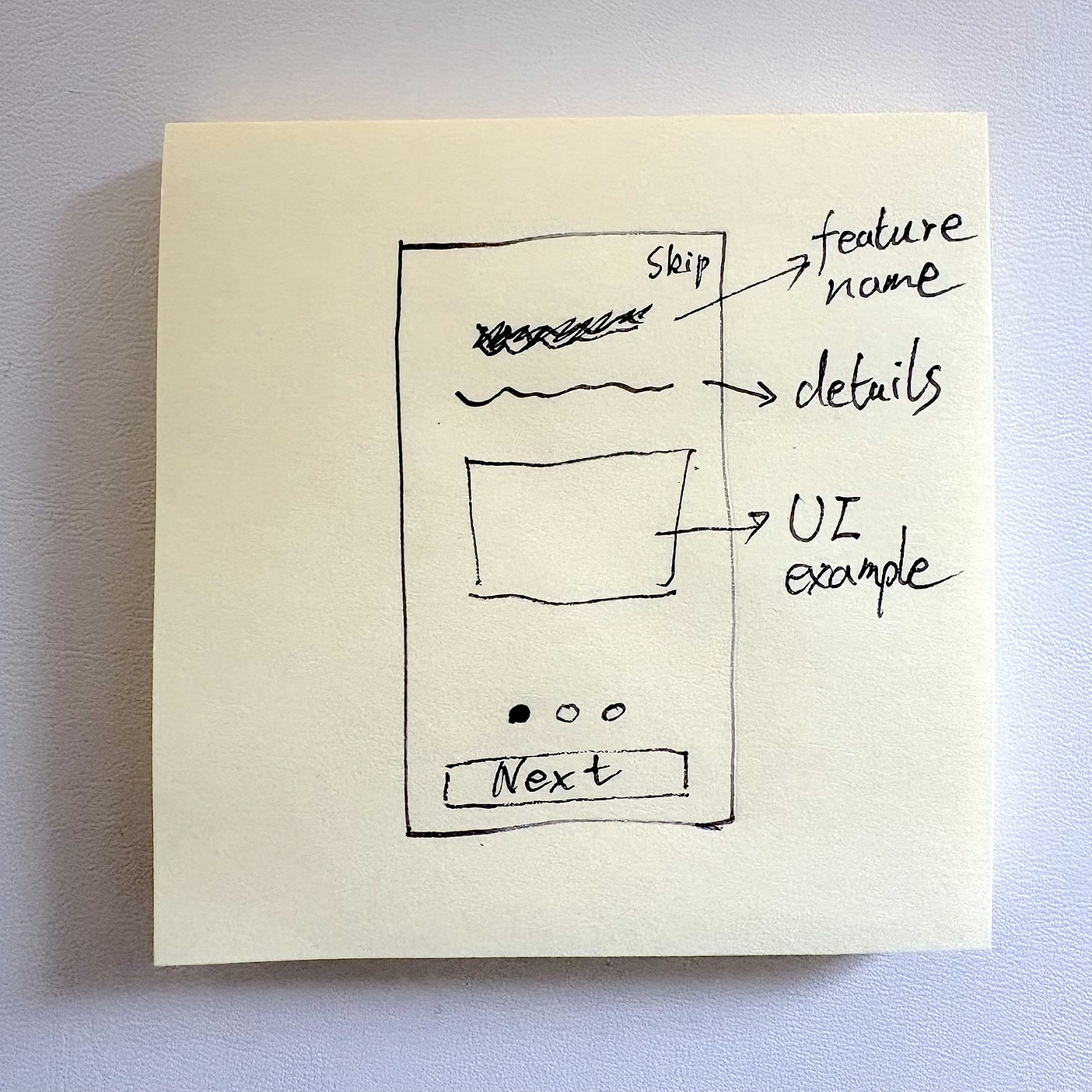
Along the way, I found that in some cases a quick paper sketch got an idea across to Claude faster and more accurately than a description, like the onboarding pages.
Design system and details in Claude Design
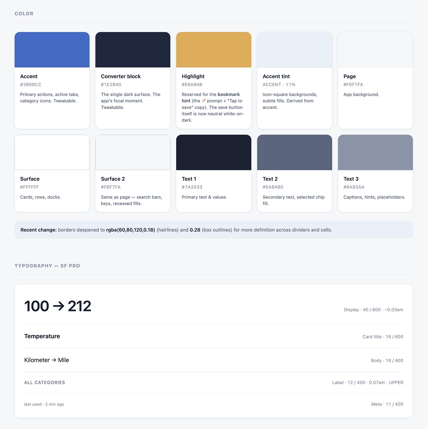
In Claude Design, I explored several directions and chose a calm, cool-toned design system that conveys simplicity and reliability. For P0, I covered the accessibility fundamentals: contrast, small screens and basic VoiceOver. Dark theme, high contrast and other devices are future enhancements. Then I worked through each feature’s details and flows.
Prototyping throughout
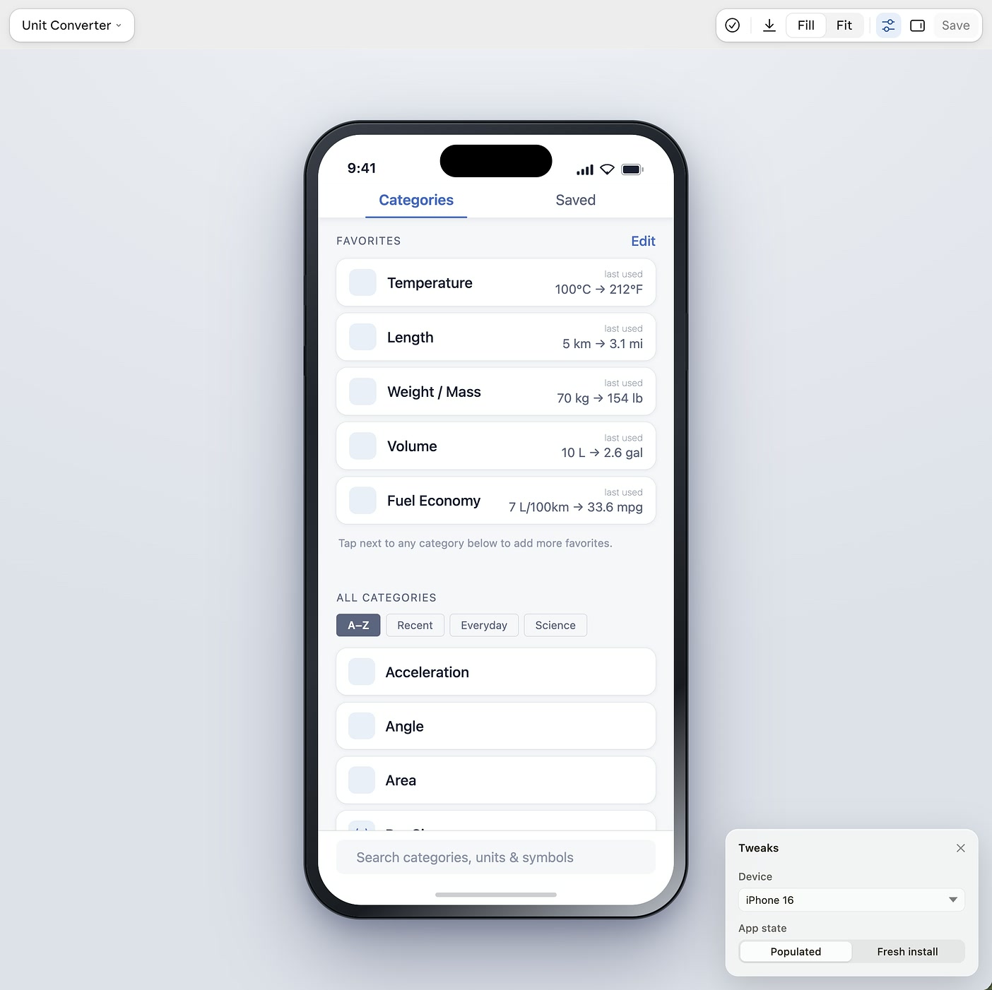
As I designed the details in Claude Design, the design became a clickable prototype that runs in a web browser. I tested the designs on different phone screen sizes, and also designed some of the interaction and haptic behaviors along the way. Later, the prototype became the reference for the build.
Tech Development Plan, Vibe Coding & Testing
Learn the process before building
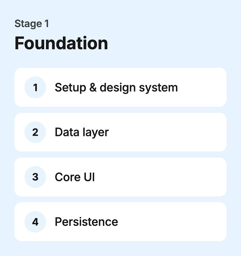
Instead of asking Claude to build features right away, I first asked it to teach me and recommend the right development process. Then, with my PRD, I asked Claude to create a detailed project plan: high-level phases, and small steps that each focused on a single topic.
The plan had 14 phases, each building on the last. A step was complete only when it built, passed its checks, and was committed to Git, so every step was recorded and easy to roll back. I logged every decision in the plan with its date and reasoning.
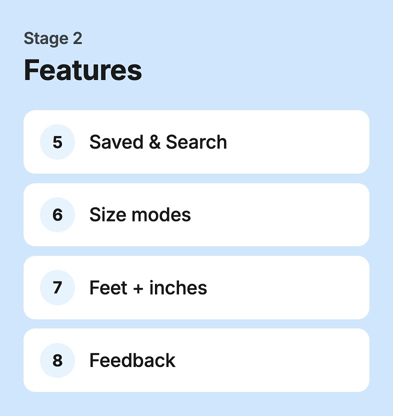
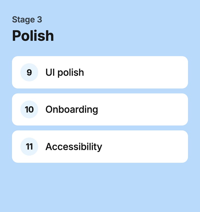
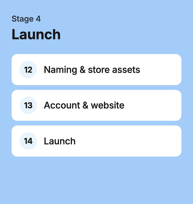
My working setup
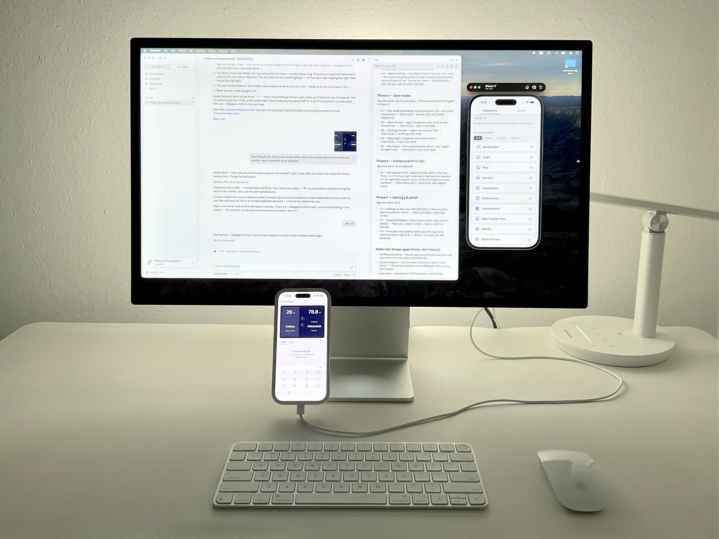
Claude Code and the iOS Simulator sat side by side. I followed the detailed steps in the project plan: Claude built each one, and I reviewed it and gave feedback. Once a step was solid and ready to move on, it was committed. Each session covered one or two features and took about an hour.
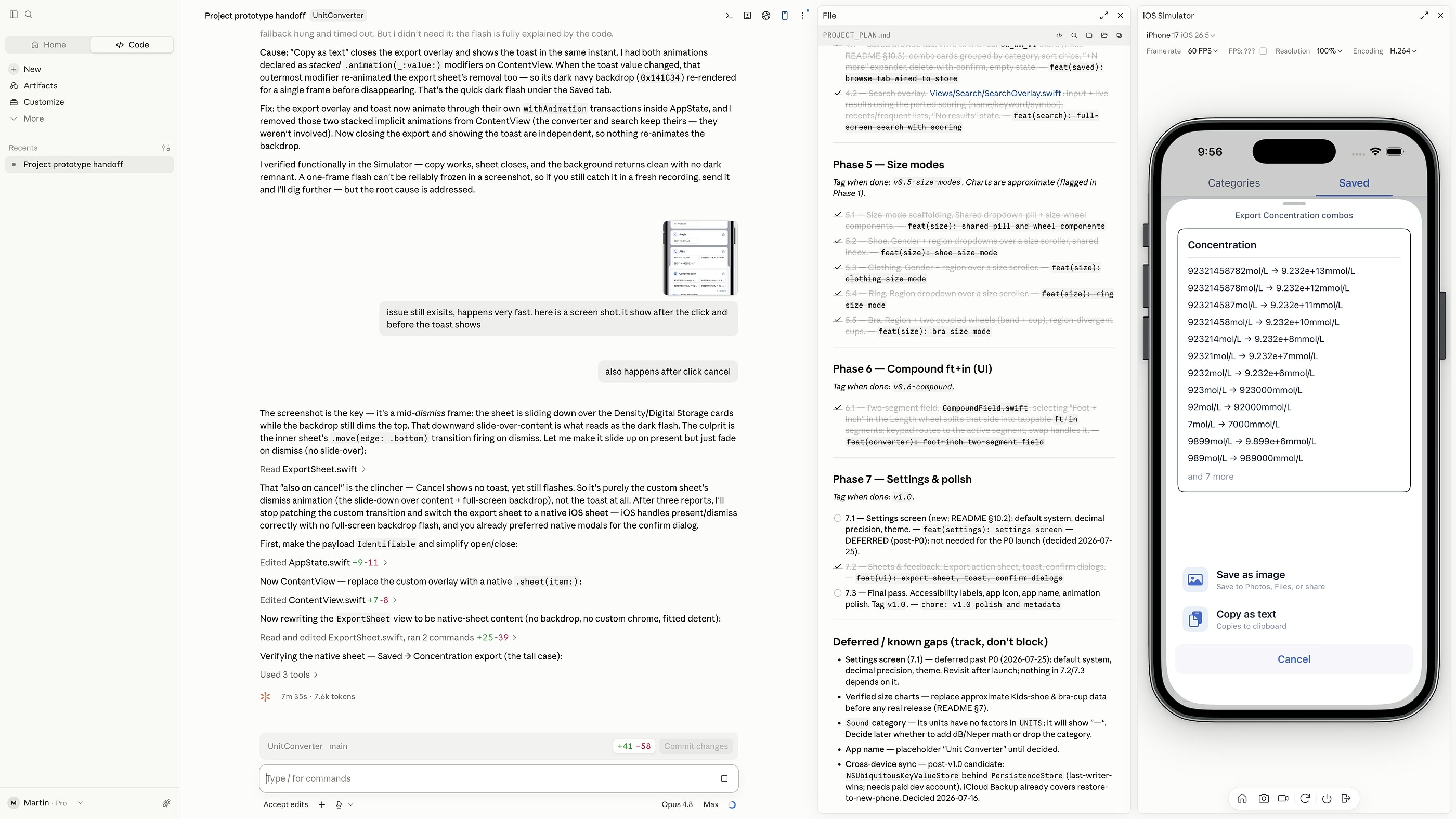
Three kinds of testing
I used three kinds of testing: Claude ran tests, reported errors and gave recommendations; I tested in the Simulator on my desktop; and I tested on my phone. I gave Claude detailed feedback in text and visuals to fix the details.
App Store Launch
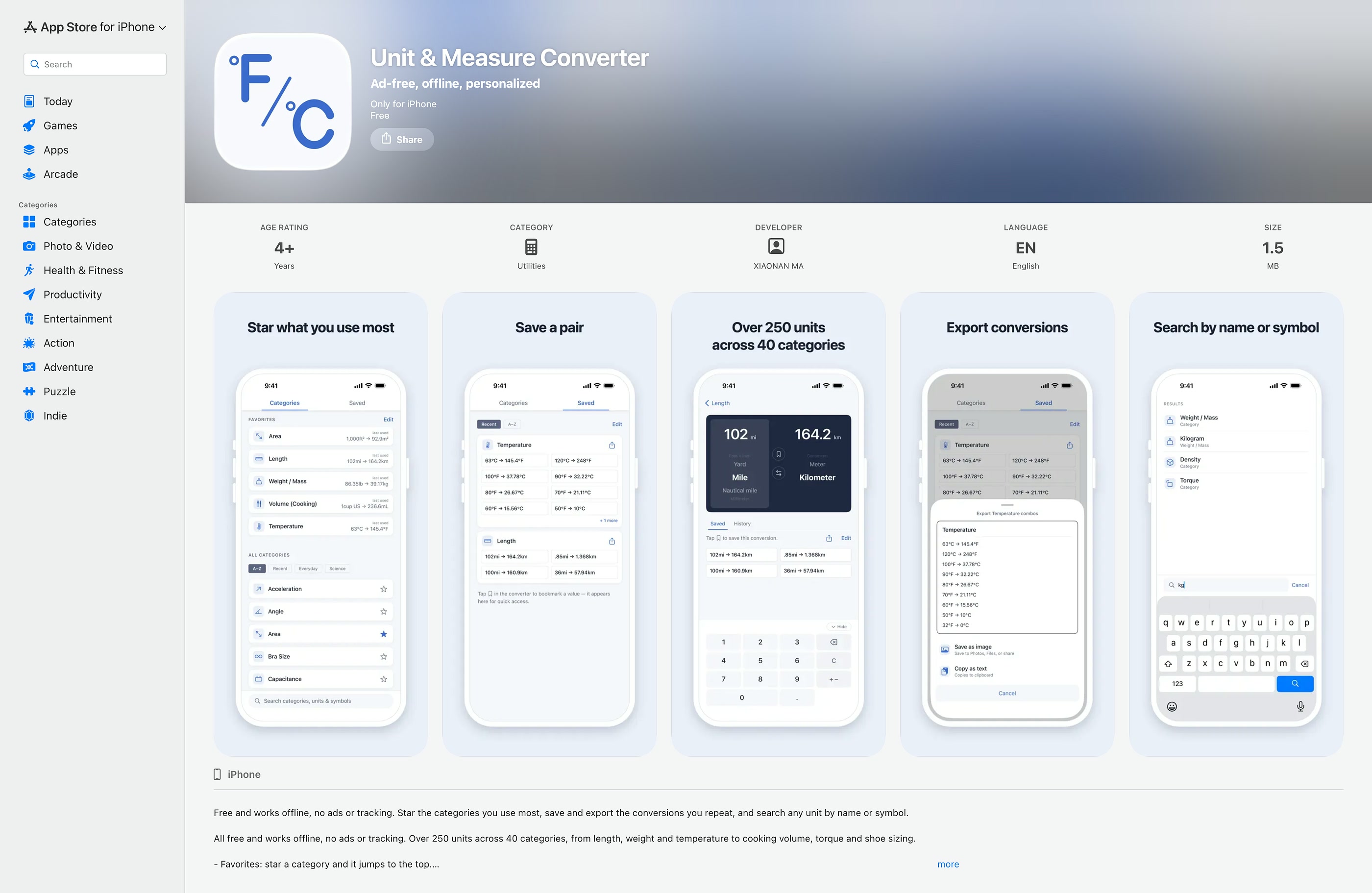
Once the build ran smoothly in the Simulator, I turned to a new area to learn: Apple’s app launch process. I enrolled in the Apple Developer Program, then worked on the app name, keywords and store preview images. After I submitted the app, App Review asked for more information, including a demo video. No bugs were found, no code changes were needed, and the app launched a few days later!
Effort & Lessons Learned
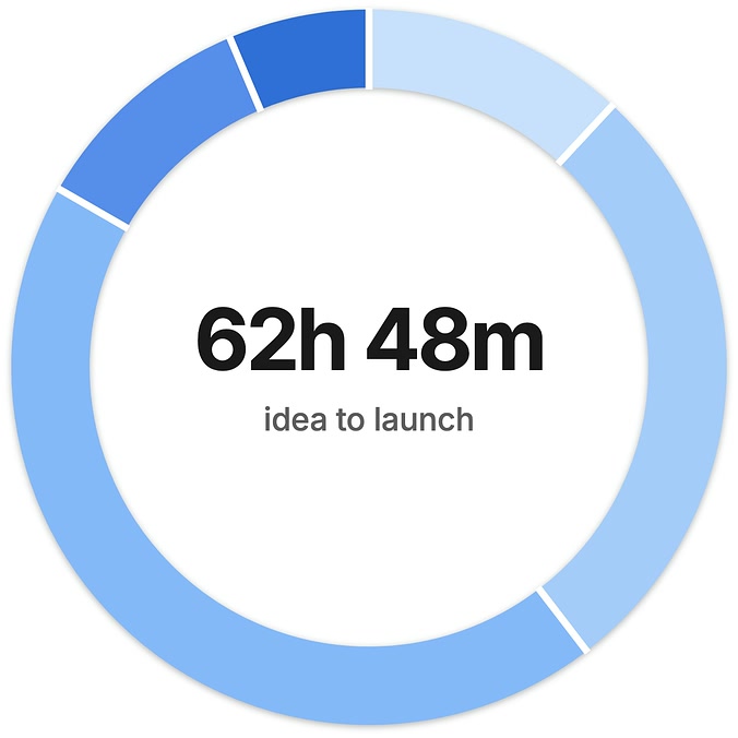
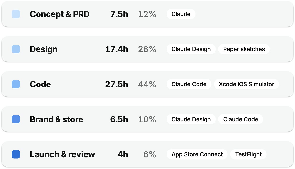
Overall, I spent 62 hours from idea and product requirements to building, testing and App Store launch. Coding took the largest share, but more than half the time went into the product, design and launch. Through this exploration, I learned new tools, new ways to design and build with AI, and more.
-
Have a plan, don’t rush into details
Defining a strategy and making a plan before jumping into details has always been one of my strengths. Taking time to plan and define an achievable scope makes the process efficient and avoids duplicated or throwaway work.
-

Adjust quickly and focus on the big picture
Things don’t always turn out as planned. New challenges and ideas come up along the way. Focus on the big picture, and react and adjust to keep moving forward.
-

Embrace the unknown and ask questions
I knew the tech workflow only at a high level, so I asked Claude and learned the right process. It’s OK not to feel confident about or understand every detail. Focus on the process, the results, and making a good product that users like.
-

Marketing matters
As expected, the app didn’t go viral or reach the top of its App Store category. But I also realized that with hundreds of similar apps on the App Store, marketing strategy and effort are essential to gaining visibility and traffic.
What’s Next
For this app, I’m monitoring the App Store analytics and using the app myself to note improvement opportunities. I also plan a next version that adds features and enhances the accessibility I didn’t build for the initial launch. I’ve learned a lot from building and launching this app, and I’m looking forward to turning my other ideas into reality.